 ®
®
Epitomax® 9.0
Last Revised – January 24,
2017
Welcome Message: Click here for a
Welcome Message demonstration video
With the updated user interface,
there is a message as part of the menu header that lets you know who is logged
in:
![]()
Responsive Design: Click here for a
Responsive Design demonstration video
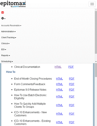
Epitomax's user
interface is responsive to the user’s screen size. The menu dynamically resizes
based on the user's screen width.
Large Screen Width:

Mobile and Smaller Screen Width:

Combined Menu and Header: Click here for a
Menu/Header demonstration video
The menu ( left
navigation ) and header are merged in the new UI.
Original UI:
![]()
New UI:

·
The Alert, Inbox,
Bulletin Board and Direct links are now located in the Envelope section.
o The envelope will change colors depending on
whether you have messages or not. If you
do NOT have messages/Alerts, it will be black. If you have messages, it will be red (like it is on the screen capture).
·
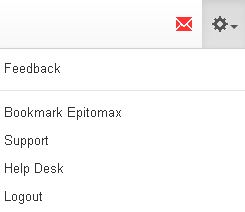
The Logout, Feedback,
Help Desk, Support, Help, Home, Bookmark Epitomax
links are located in the Cogwheel section.

Bulletin Board: Click here for a
Bulletin Board demonstration video
Original UI:
The Bulletin Board information was
previously in black font and would scroll across the screen if configured to do
so.

New UI:
The Bulletin Board is colored
Bright Yellow and is attention-grabbing. The Bulletin Bar is closeable but will
display once a user logs back into Epitomax to remind
them of the message.

Epitomax System
Alerts: Click here for a Epitomax System Alerts
demonstration video
Original UI:
The Urgent Alert Message from Epitomax [if there is an urgent system wide notification to
all customers] was originally displayed in red text in the header.
![]()
New UI:
The Alert is colored Bright Red,
and is an eye catching bar that stays across the top of the screen to ensure
everyone will notice it.

Menu Details: Click here for a Menu
Detail demonstration video
The Sections and Pages have moved
from the left-hand toolbar to a top menu.
·
This provides more
screen real estate for one to be able to see pages.
·
Makes Epitomax easier to use on mobile devices.
·
Note: Activating and
deactivating sections (drop downs) and pages (menu items) will continue to be
configured in Security Maintenance.
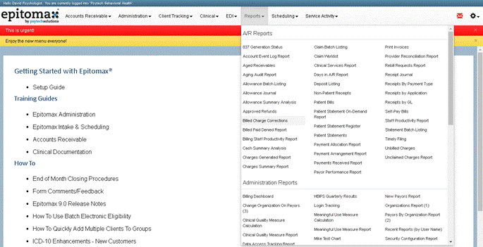
Reports are now
ALL under the Reports drop down menu.
You would previously have to go to different sections in the toolbar to
find them.
If you historically used the
"Customer Satisfaction" section, this will now be called Client
Satisfaction and is located under the Client Tracking drop down menu for you to
be able to record your client complaints in the same place where you work with
the rest of your client menu items.
Info Buttons: Click here for an
Info Buttons demonstration video
Epitomax has
converted the client record header and episode header to "Info
Buttons".
Client Info Button:
![]()
·
Displays Name, Case #,
DOB, Universal Patient ID (if the client has one) and any Alerts the client
has.
Episode Info Button:
![]()
·
Displays Admission
Type/Program, Status (if Closed), Date of Admission and Date of Discharge (if
Closed).
This replaces the original
Patient Record and Admission Headings:
![]()
![]()
Info Buttons have been designed
to help users quickly navigate through the system. Clicking the "X"
will remove the button. If you are currently working in the Client Record and
close the Client Info button, it will re-direct you to the client "Quick
Search" so you can select a new client. If you are not working in the
Client Record and close the Client Info button, the information will be cleared
only and you can continue working without being redirected to the quick search.
Clicking on the description on the info button will direct to the related
"Home Page" of that info button ( ie. the Client Record will take you the client
record screen. )
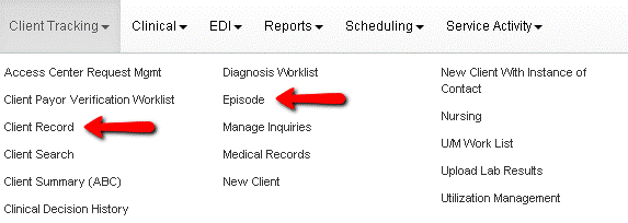
Menu Items & Info Buttons: Click here for a Menu
Items & Info Buttons demonstration video
Some menu items in Epitomax use information from the Info Buttons to more
quickly take you where you want to go. Common examples are the "Client
Record" and "Episode" links. Previously these menu items were
hidden until a user was working in client record or episode respectively and
clicking them would take the user back to the main Client Record or Episode
screens. Now these menu items will always be shown. If a menu item is selected
and the corresponding Info Button is not already populated, you will be
directed to a "Quick Search" to provide that info before being
forwarded.
NOTE: If no Info Buttons are listed, the "Client Record"
and "Episode" menu items are a great tool to quickly search and
navigate records.
Original UI:
Menu Items such as Client Record
and Episode would be hidden/shown based on where you
were in your navigation of the client's chart.
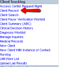
New UI:
Menu Items such as Client Record
and Episode are always visible to provide a quick search.
